
MyHealth Design System
Built a scalable unified Design System for improved communication and efficient hand-offs between multi-disciplinary teams.
Summer 2025
Documentation
Prototyping
Engineering Alignment
Ji Sun H. (Sr. UI/UX Designer)
Chris F. (Sr. UI/UX Designer)
Rui L. (Manager, Mobile Applications)
Michael (Lead Software Engineer)
CONTEXT
Building a unified Design System for effective communication
I worked at Stanford Health Care, a leading academic medical center recognized for its advanced medical care, research, and technological innovation, as a UX/Product Design Intern. As part of the Software Design and Development team, I contributed to the MyHealth ecosystem, Stanford’s core patient-facing platform. I focused on addressing design inconsistencies within the mobile experience and played a key role in building the foundational MyHealth Design System from the ground up.
THE CHALLENGE
Designing for small cross-functional team
"How do we build a scalable design system in Figma, with documentation that mirrors our brand guidelines to bring consistency and reduce handoff friction across a small cross-functional team?"
"As a designer, sometimes it is difficult to go back and forth with developers to ensure consistency."
SR. UI/UX DESIGNER, MYHEALTH TEAM
BACKGROUND
What I bring to the table building design systems
I have built 3 design systems with 3 different teams since 2021 in different industries, reiterating my approach based on the evolving tools and workflows. Currently, I am building an AI design system to automate design components into the code pipeline for ASM America, Inc.

Human Machine Interface
Common Software Architecture GUI
Design System
MyHealth
Design System
Documentation

SaaS
Internal Tool
Design System
THE SOLUTION
Featured work
The MyHealth Design System contains features that solve the real problems, following a systematic approach and documentation that is easy to navigate by cross-functional teams. This design system was built for everyone and not just designers.


APPROACH
Aligning scope and conversation with the "users"
Design systems are not static and they need to be scalable over the organization. We approached this problem with an iterative and collaborative design thinking approach at the organization and MyHealth system level. To understand the team’s requirements, I interviewed key stakeholders including designers, developers and marketing team to understand their expectations from the design system. Our conversations revealed their specific expectations and a common theme, the need for “effective communication” and “standardization”.
Goal
Improved prototyping efficiency
Enable the design team to leverage reusable root components for rapid prototyping, efficient design iteration, and faster development handoffs.
Goal
Systems thinking approach
Building the components brick by brick, documenting primitives and elements to benchmark visual consistency.
Goal
Design documentation and governance
Standardize semantics to enable seamless understanding across design, product, marketing and development teams.
Uncovering Pain Points
My conversations with the multi-disciplinary teams in the Technology and Digital Solutions department helped me identify and uncover the current problems, gaining deeper insights into their pain points. I leveraged these data points to formulate our goals for the design system.
Problem
Lack of flexibility
The current design files had rigid UI components that did not allow scalability and customization, increasing maintenance overhead for each feature rolled out.
Problem
Inefficient hand-offs
Lack of primitive component library for reference resulted in visual inconsistencies and repeated back and forth with the development team.
Problem
Lack of governance
The lack of centralized guidelines caused confusion and hindered enforcement of best practices during implementation.
DESIGN
Primitives
Primitives are the foundational building blocks of the MyHealth Design System, encompassing core design attributes. They were meticulously defined to ensure consistency and coherence. All the foundational primitive were declared and documented as global variables and styles in Figma.
Color

Logo

Iconography
Aa
Typography

Layout
DESIGN TOKENS
I organized the colors based on their usage: Primary, Secondary, Neutral and Brand. The global color match the branding guidelines, we build the design tokens based on their semantics, usage and hues.

Elements
Elements are the atomic building blocks of the MyHealth Design System. Elements like buttons, controls, and inputs, were meticulously defined, designed, built and documented in Figma as base root components.

Traditional user interactions for control elements are either "selected" or "unselected" states. However, a control element expands over variety of use cases that reflect the user psychology to refine how human perceive when they are interacting with the interfaces.

Components
Components are UI frames that were built from the basic primitives and elements in the MyHealth Design System. They aid rapid prototyping and design iteration as well as screen building for faster hand-offs.

TEST
Stress testing components
I stress tested the components with the Sr. UX Designer to break the design under different conditions. Our main goal was to test wether the texts, titles, labels and placeholders don't overflow the container in the design. Although we were successful in most cases, we discovered edge cases in certain components that I reiterated. Additionally, I validated all the existing component designs with accessibility guidelines.
BEFORE

AFTER

FEEDBACK
Design and Engineering Review
I gathered feedback through both design and engineering reviews throughout the project to aid faster iterations. Based on the team's feedback, I reiterated the documentation design, adding design token container and implementation snapshot.
Revised Documentation
BEFORE

AFTER

Change Log
Since the design team work on multiple projects simultaneously, it was difficult to trace back components and changes to each team member. We added a team governance in change log with description.

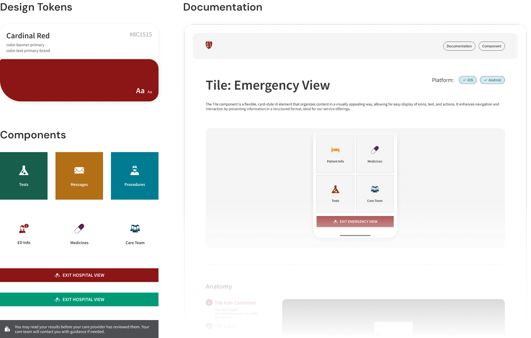
DOCUMENTATION
Final Document Design
I created the final documentation for UI guidelines and references. Designers can modify, rearrange and plug and play with the sections according to their requirements. We collectively decided to exclude the Don'ts in the best practices section for component usage to avoid any form of redundant communication, since this design system is built on existing applications for internal teams only. However, this section can be modified for newly designed components.
The goal of this document was to make the component documentation and content more approachable and effective for new team members, developers, product and marketing teams.

1. HEADER CONTAINER
🌎 Global container: To be used across all documentation.
🏷️ Clear tagging to indicate the type of document.

2. DESCRIPTION CONTAINER
🌎 Global container: To be used across all documentation.
💡 Component semantics for clear communication.
📱Platform availability to aid the web, iOS and Android developers identify the correct components.

3. IMPLEMENTATION CONTAINER
💡A snapshot to identify the component used in MyHealth, reflecting the existing design patterns.

4. ANATOMY CONTAINER
💡A brief overview of the anatomy of primitives/elements that were used to build the primitive/component/element. This feature is useful to break down the design patterns into identifiable semantic tokens for developers.

5. COMPONENT OPTIONS CONTAINER
💡Design rules and guidelines along with clear component options to aid efficient hand offs.


6. STICKER SHEET
💡Copy paste into designs for rapid prototyping.

7. DESIGN TOKEN CONTAINER
💡 Efficient development hand off and to match with their existing storybook pattern, and global tokens declared in Figma as variables.

8. FOOTER CONTAINER
🌎 Global container: To be used across all documentation.
SHIP
Design Adoption and Growth
I believe that design is never static. This design system will continue re-iterating and growing on the foundation I laid with my team.
DOCUMENTED
30+
Most used components across MyHealth Ecosystem.
SHIPPED
150+
Primitives, elements and components.
DESIGN IMPACT
85%
Reduction in screen prototyping time.
REFLECTION
Key learnings and takeaways
Design systems are an infinitely growing jigsaw puzzle, I learnt how to make a system that is flexible but highly impactful. The biggest achievement of my work on this project was getting positive response from both the engineering and design team. I learnt how to balance both the team's needs.
