AI enhanced search
Designing a conversational search experience for Stanford: School of Medicine website that redefines how users go beyond traditional search results.
Summer 2025
User Research
Prototyping
Engineering Handoff
Zakary A. (Sr. UI/UX Designer)
Meghana Y. (Software Engineer)
Sathiya S. (Director Web Platform)
Aditya B. (VP Software Design & Development)
CONTEXT
Led the phase 2 implementation of Search with Generative AI
Stanford Medicine, a leader in the biomedical and healthcare revolution, has pioneered the integration of AI into core workflows. In this project, I redesigned the AI-enhanced search experience for the Stanford: School of Medicine and introduced a conversational AI search feature. The goal was to increase user engagement, drive more high-quality queries and clicks, and elevate search performance across the Stanford ecosystem.
I led the phase 2 implementation expanding the AI overview into conversational search and closely collaborated with the leadership and the engineering team to build and launch the experience.
THE PROBLEM
The previous design was invasive
The previous design for the AI Search Overview followed invasive UX patterns, pushing down organic search results and forcing users to engage with the AI overview feature.
"But what if I don’t want to go through the AI overview?"
SHC EMPLOYEE, INTERNAL USER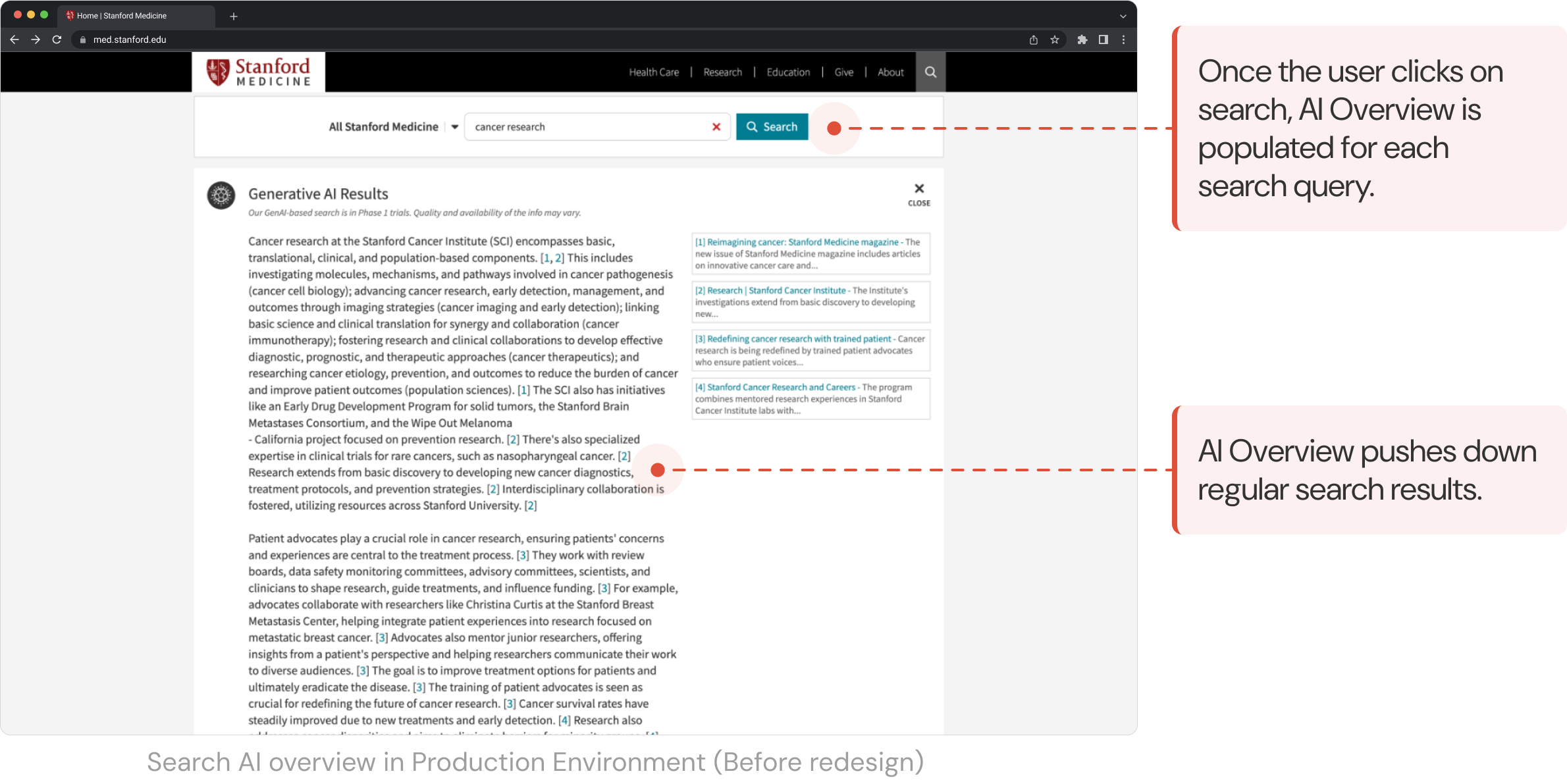
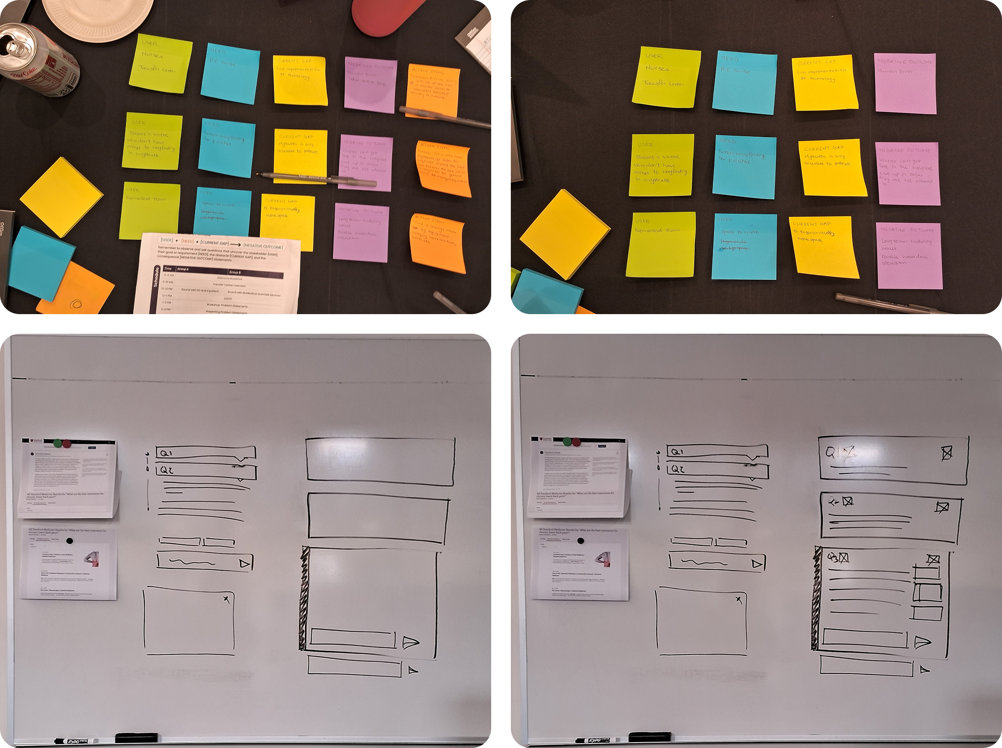
RESEARCH AND VALIDATION
Data-driven approach
We approached the problem through a data-driven perspective to help identify the root cause of the frustrations in the previous implementation.
Data Visualization
Heatmaps analyzed from Activity Maps revealed that users often clicked on the Close AI Overview, indicating their preference for regular search results.
Journey Tracking
Adobe Analytics showed higher drop-offs after the user searches for a specific keyword, since the AI Overview feature introduction.
Internal User Testing (Test Environment)
Performance-based metrics like task success rates, time on task and conversion rates (did the user click on references?) were collected along with user satisfaction scores.
Core Issues Identified
Invasive
The AI Overview pushed down the organic search for the users dominating the visible interface.
Lack of user control and freedom
The AI Overview and AI Mode forced users to engage with it. They expressed both behavioral and verbal frustration.
Lack of Visibility
Most users were unable to locate the follow up input without clarification, since the search output dominated the visible interface.
Friction Points
GOALS
Outlining Business Goals
The leadership at Stanford Health Care sought to retain users within the Stanford ecosystem and create a more balanced, user-centric experience by integrating a conversational UX feature (AI Mode) in the existing AI enhanced search capabilities. I discussed the project scope with the UX Director and the VP, Software design and development to understand the business goals and outline the business expectations from this project. Our goal was to improve the core search user experience across the website.
Mapping Search Journey
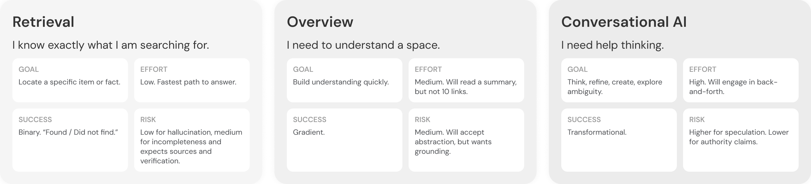
Technical Alignment: Is this feasible?
The design team closely discussed with the engineering team to understand the technical restraints, pitching potential solutions through whiteboarding, defining the problem scope through collaborative sessions.
DESIGN
Wireframing the conceptual design
Based on the user research and aligning them with business goals, I quickly produced wireframes to showcase high level conceptualization of the new design. Followed by reviewing this conceptualization, I explored 10 versions of conversational AI design, focusing on chat format.
Proposed Solution 1
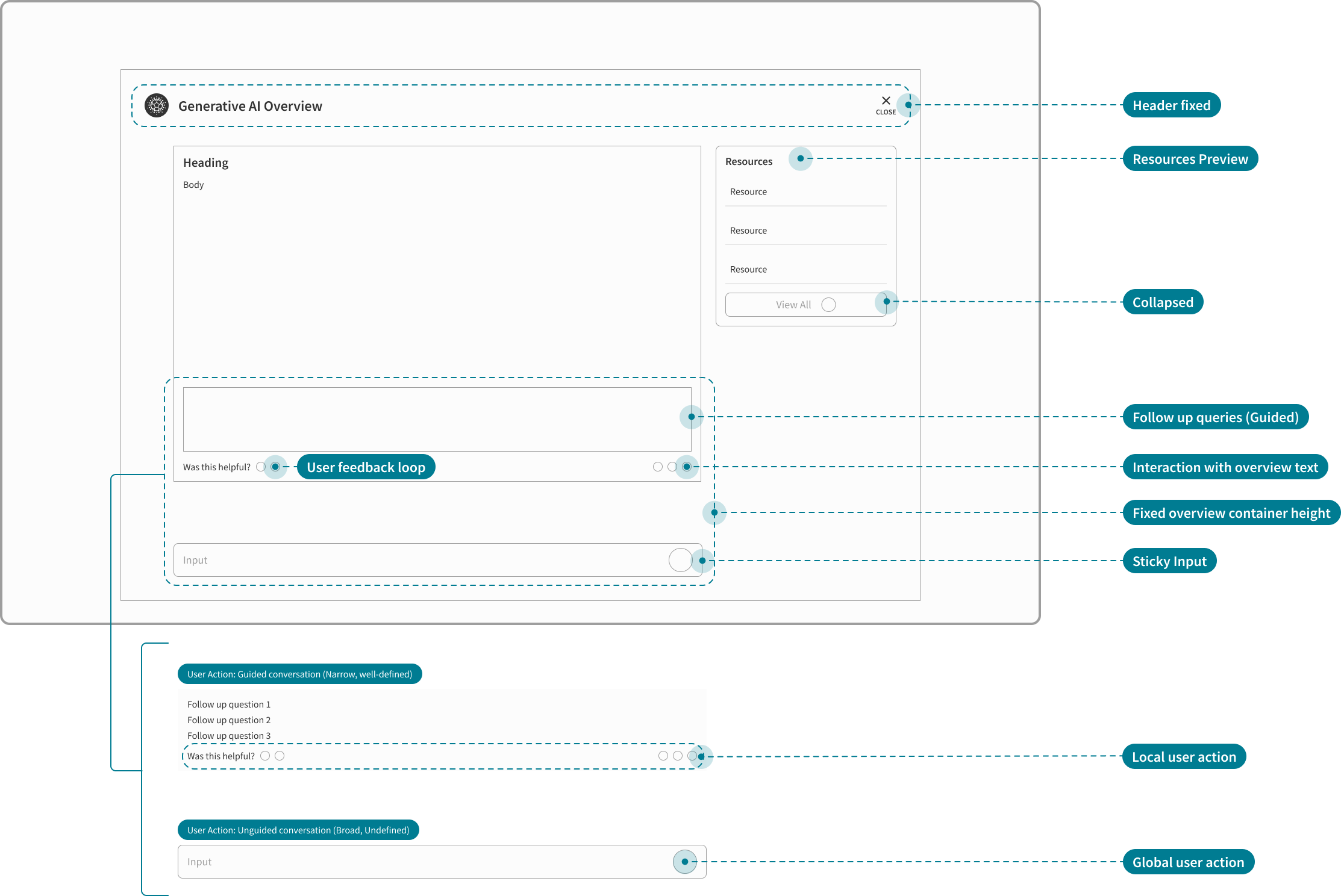
I brainstormed our project's interaction design with the UX Director down to micro-interactions to address our primary research findings and pitched the solutions to the engineers. We presented a mid-fidelity overlay solution aligning it with leadership expectations.
Addressing friction points
Non-invasive
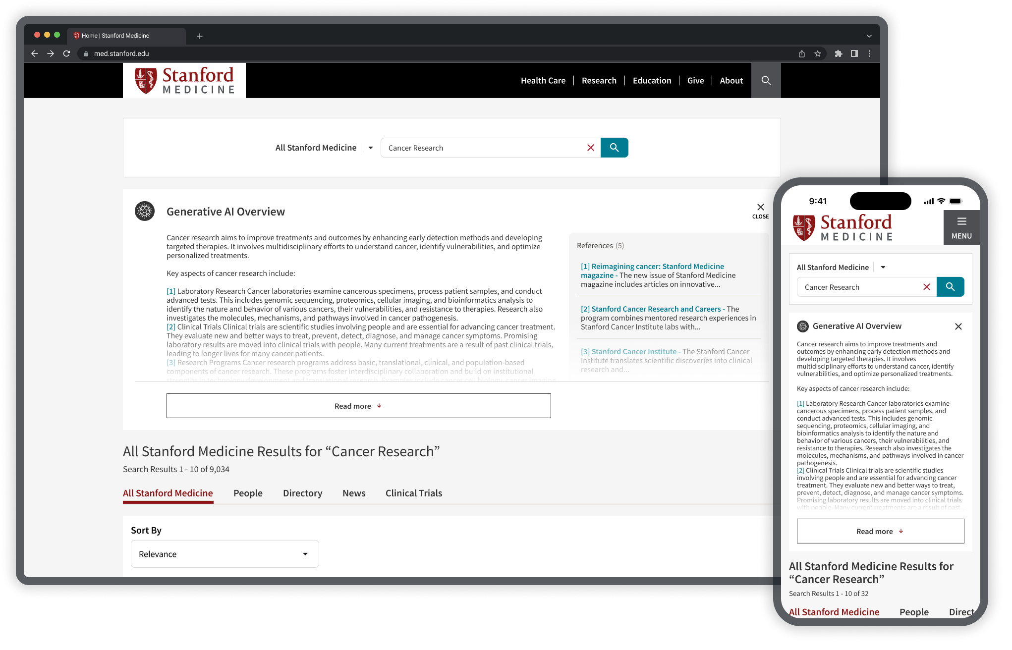
Collapse the AI Overview as a preview allowing users to sight the organic search results first.
User control and freedom
Set the close button to a fixed but visible position that is easily discoverable by the users.
Visibility
Fixed container height with follow up query input set to sticky. This draws the uer's attention to the dive deeper and ask more questions.
Constraints uncovered after engineering review
No search history recorded
Deep dive into AI mode should not feel like the regular conversational AI. Search history will not be reflected after the session expires.
Lock the user in
Users should not leave the Stanford Medicine website ecosystem. Overlay design must be avoided at all costs.
No edit option
Users should not be able to edit the prompt, if they want to fix, they can enter a fresh query.
Proposed Solution 2
Following the first round of feedback, I brainstormed another potential solution with the Sr. UX Designer which led us to exploring AI Mode as a separate tab in our iteration.
Addressing engineering challenges, aligning to shifting business goals and user needs
Continuity
Remove accordion format for chat history, keep history chats continuous.
AI Mode tab in regular search
Allows the user to stay within the Stanford ecosystem. No clutter, and users can easily switch between regular and AI search mode.
Reduce cognitive overload
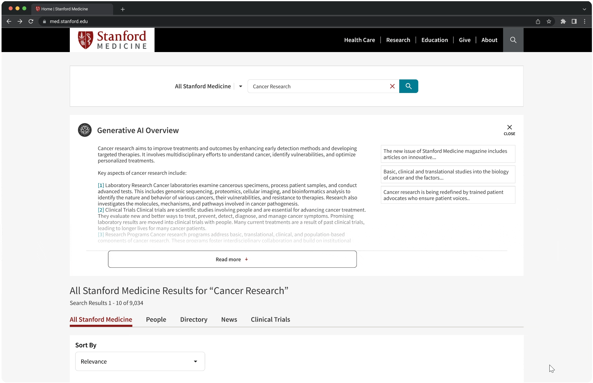
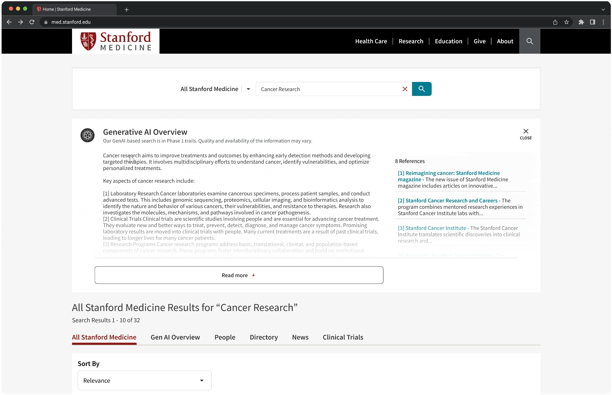
Limit the number of resources in the resources container to 3-4 so information is easier to scan and the container height does not exceed the generated overview height.
Constraints uncovered after engineering review
Auto populated search
AI Mode tab will result in newly populated search query for organic SOM search which is not feasible.
Hide the regular search
The conversation will take over the organic search once the dive into AI Mode to avoid newly triggered queries.
Resources as a single list
All resources should be listed instead of a collapsed preview.
Design Pivot
After synthesizing the developer insights and recommendations, we pivoted our design into a much simpler approach, testing micro-interactions solutions with A/B testing. Post A/B testing, I carried another brief round of internal testing to address the collapsed resources design decision. With a positive feedback on the feature from users and redesigning the resources to 3 in preview mode, shaping the final design.

Insights
- 80% users did not interact with the references directly.
- Users expressed clear preference for collapsed references.
Recommendations
- We recommended limiting the references preview to 3 for each content generated.
- We shared this solution to the engineers pressing on user needs and to reduce cognitive load on users.


Advocating User Needs
From user testing, it was pretty evident that most users did not interact with the references. 40% users clicked directly on the link in the overview. To avoid cognitive overload, I designed the references container, limiting the references to 3 for the first preview. Although the engineers assured us that the length of the references container does not exceed the overview, the design team strongly advocated limiting the height of the container to 3 references only.

Featured work

FINAL RESULTS
Impact: Pre-Launch
Based on the internal user testing, we observed the following measurable impact and design leadership design approval. Since the feature was finally rolled out after my internship ended, I do not own or claim the impact for the same.
64.8%
Improvement in regular search discoverability.
80%
Improvement in lead quality clicks.
58%
Users reported that they liked engaging in the AI Mode.
STAKEHOLDER ENGAGEMENT
Actionable Project Timeline
Since the design and development teams were working on multiple projects simultaneously, we followed the following project roadmap to make our deliverables and ideations more actionable.

Cross-collaboration
Leadership Alignment
Employing user review and data driven to present the design decisions. I co-presented this design with the UX Director to the CEO David Entwistle.
Design Validation
Fine tuning micro and macro interactions through continuous feedback and discount usability testing.
Engineering Collaboration
Delivered feasible interactions while advocating user needs and expectations through iterative design.
REFLECTION
Key learnings and takeaways
During my internship at Stanford Health Care, I had the opportunity to work in a highly collaborative and fast-paced environment, gaining hands-on experience across multiple projects simultaneously. Working with a small, cross-functional UX team and partnering with diverse stakeholders-including healthcare providers and academic leaders, strengthened both my design and communication skills. This experience deepened my ability to navigate complex systems, collaborate effectively, and deliver impactful design solutions.
